Project type
Web
Focus
E-commerce platform
Role
Senior Product Designer
Client
DTM Winery
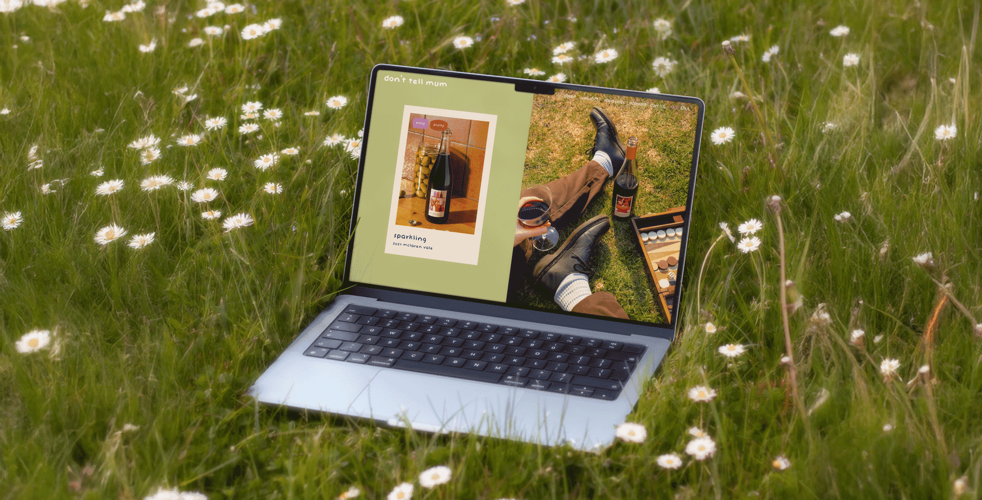
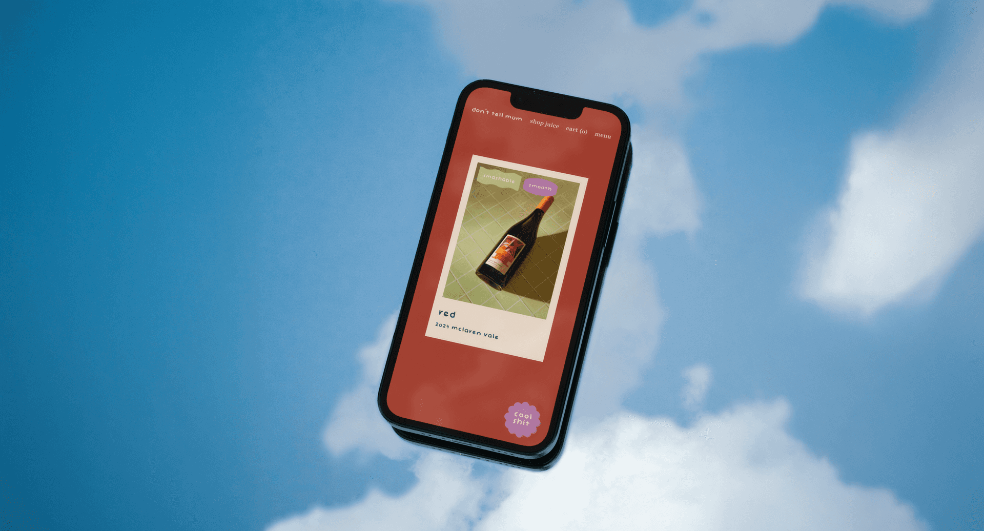
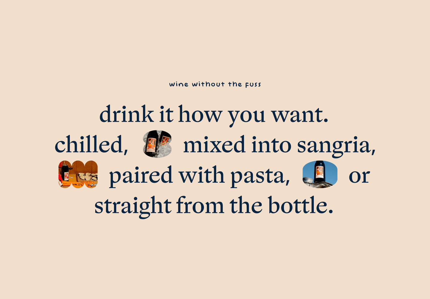
Don’t Tell Mum is a wine brand run by two siblings, positioning itself against a market dominated by traditional, pretentious wine marketing. The goal was to make wine feel approachable for younger adults looking for easy-drinking options for dinner parties and beach picnics.
My role was to design an e-commerce website that balanced strong personality with clear conversion paths, while working within tight development constraints.
Design approach
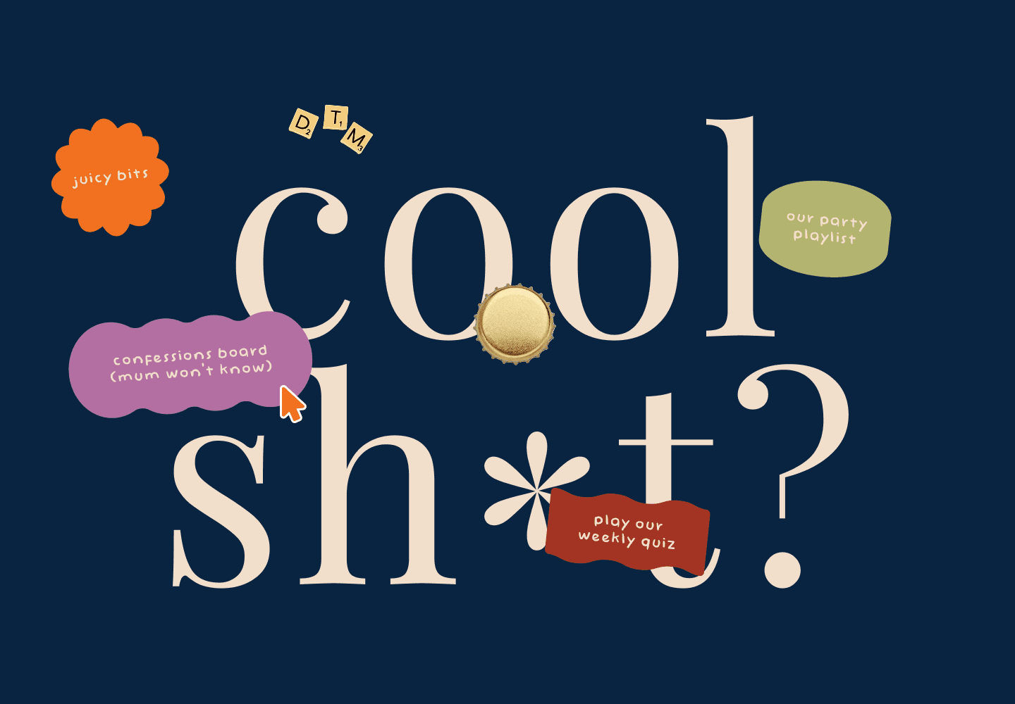
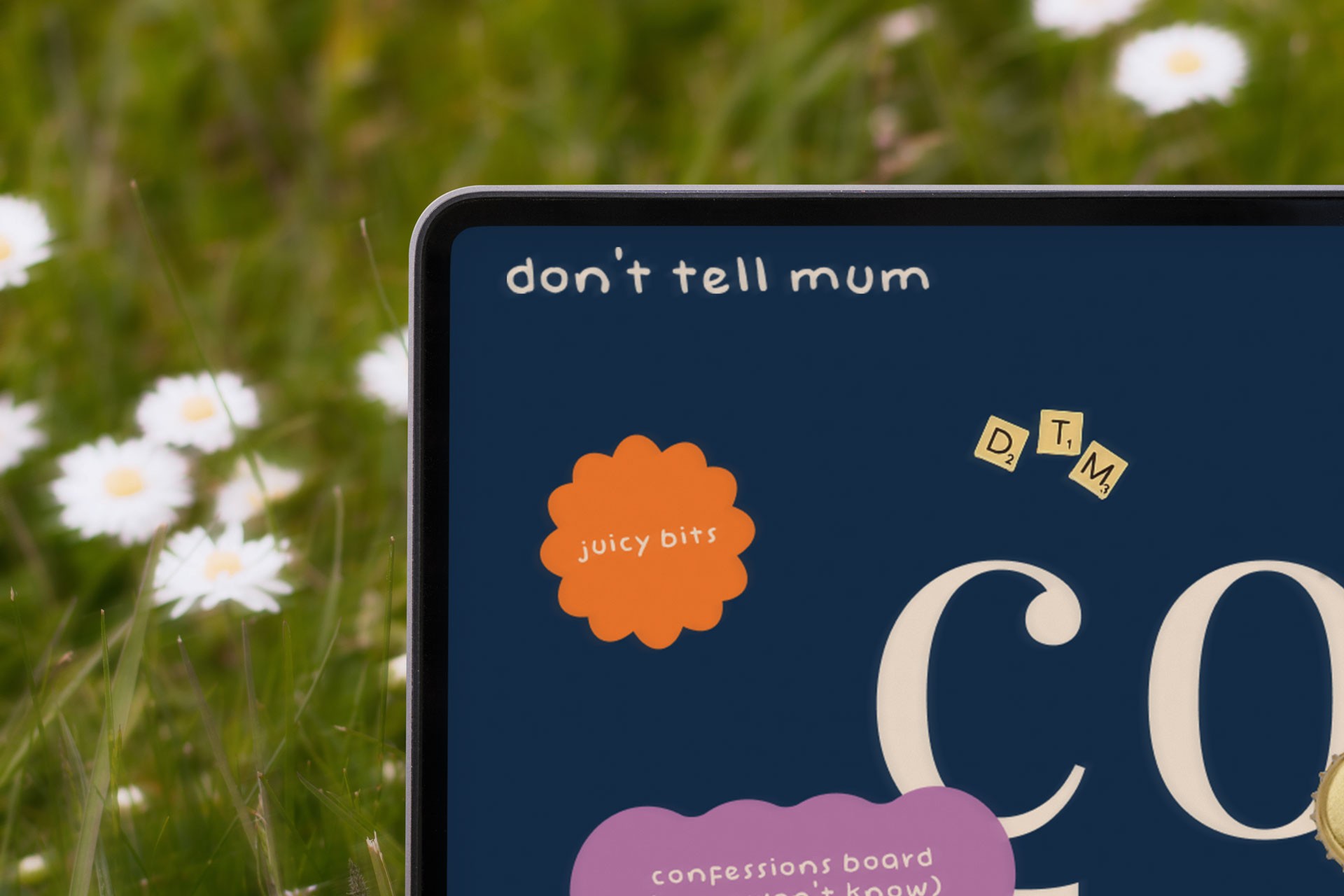
The site delivers clear e-commerce flows wrapped in strong brand storytelling. The "Cool Shit" hub transformed a transactional shop into a lifestyle destination, giving users reasons to return beyond purchasing and reinforcing the brand's personality at every touchpoint.