Project type
Web
Focus
Service-led UX
My role
Lead Designer
Client
ECH


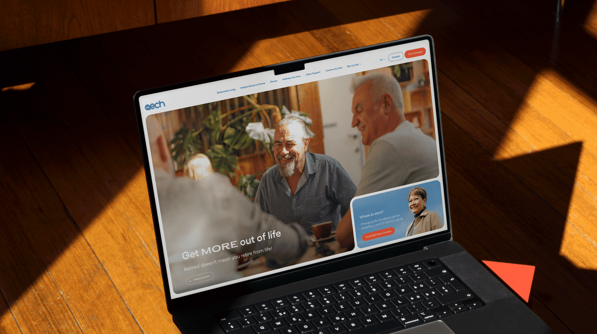
ECH, South Australia’s largest not-for-profit aged care provider, supports a wide range of services across retirement living, home care, and allied health.
The website struggled to help users understand where to start, driving 10,000+ enquiries per month to the contact centre and creating significant operational pressure.
The objective was to improve clarity, reduce unnecessary contact, and help a diverse audience confidently navigate complex service options.


A self-service decision tool supporting confident service selection and reducing reliance on phone enquiries.
Design approach
Stakeholder alignment and problem framing
The project began with a stakeholder kickoff focused on reviewing existing research and internal client experience surveys. Together, we clarified user pain points, aligned on success measures, and mapped ECH’s broad audience across age, health needs, and digital confidence.
This early alignment ensured design decisions balanced user needs, operational realities, and board level expectations.
UX research, journeys, and information architecture
I mapped existing user journeys and flows to understand how customers moved through the service ecosystem.
To surface the true level of complexity, I facilitated a content review workshop where every page involved in key journeys was printed and laid out physically around the boardroom. Making the problem tangible helped executives clearly see the volume of content users were expected to navigate and enabled collaborative decisions to simplify and remove pages.
Outcomes from this phase included:
Simplified and re-designed core user flows.
A refreshed sitemap with clear page level information architecture.
Nine distinct customer segments to support clearer targeting and wayfinding.
Design and prototyping
I wireframed the entire website in Figma and ran a highly collaborative feedback process with stakeholders across product, marketing, and leadership.
Design exploration focused on applying ECH’s refreshed brand in a way that prioritised clarity and accessibility. Every page and interaction was designed and prototyped using real content so the board could review work that closely reflected the final build.
Key improvements included:
Simplified global navigation and form patterns.
A retirement living cost calculator to provide transparent pricing information.
A reusable component library and style guide to support development and future iteration.
Retirement living discovery
Retirement living required a different interaction model to ECH’s other services. Users needed to explore availability, pricing, and location with confidence, often comparing multiple villages before committing to a next step.
The experience supports:
Suburb and postcode based search with map and list views.
Clear visibility of price, amenities, and village context.
Gallery driven property exploration.
Filters designed for older users with varying digital confidence.

Retirement living combining suburb based search, list and map views, and clear pricing to support confident comparison.
Decision tool design
A central outcome of the project was a self-service decision tool designed to guide users toward appropriate services when they were unsure where to begin.
I designed the question logic and flow, worked with stakeholders to refine language and sequencing, and created detailed screen flows and a testable prototype for review and validation.
The tool became a primary entry point for users seeking guidance across ECH’s service offering.

Results screen allowing users to review, refine, and submit personalised service recommendations with clear summaries and next steps.
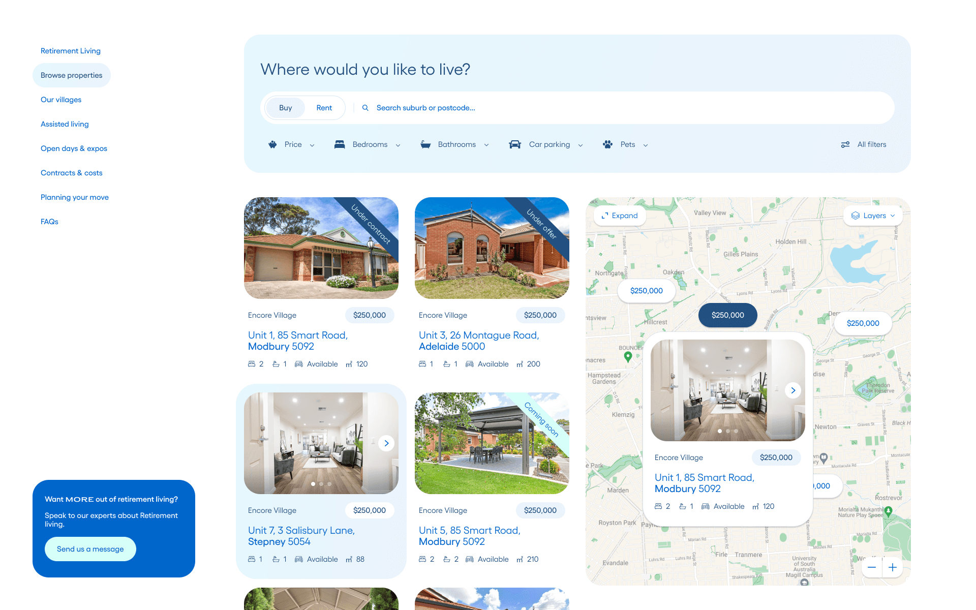
The decision tool has been used more than 18,000 times, helping users identify appropriate services through self service and reducing reliance on the contact centre, with ongoing improvements informed by analytics and user feedback.